Redesigning Fig's loan origination flow
Doubling pre-qual conversion by rebuilding a desktop-era application into a mobile-first, step-by-step journey.
The flow is the entire business
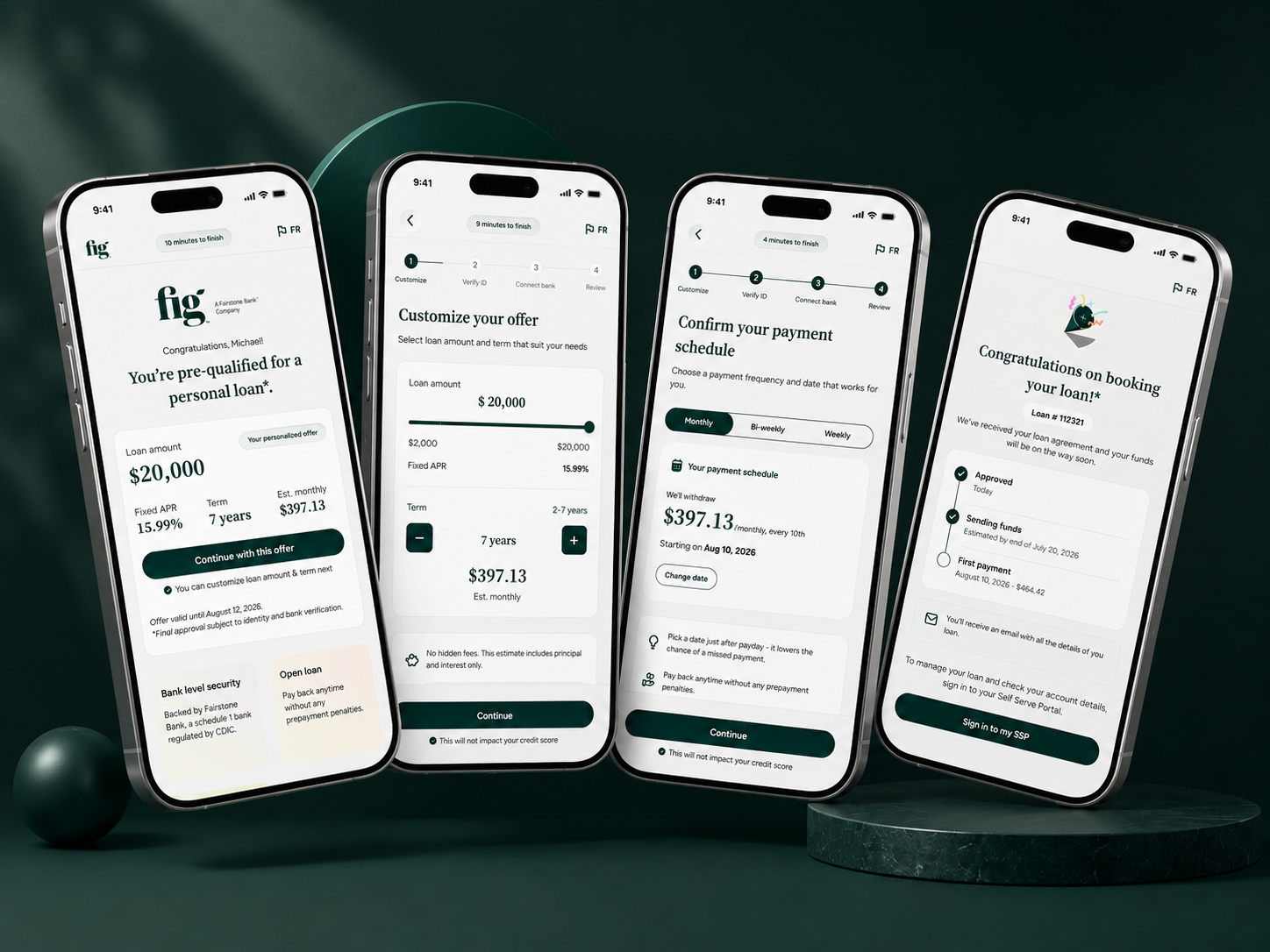
Fig, a Fairstone Bank company, offers fully digital personal loans up to $35,000 in Canada. The origination flow — 14 steps from "how much do you want to borrow?" to "your loan is booked," gated by a soft credit check at the offer and a hard check at booking — is the product. It had grown organically over time and was showing its age. My mandate was to redesign it end-to-end.
A desktop-era form, on a mobile-only user base
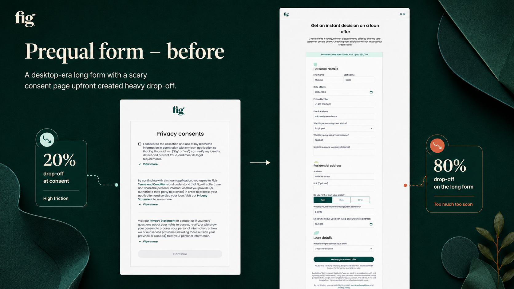
A scary consent page came first. Before users saw a single form field, a dense biometric/data-sharing consent screen asked for agreement — 20% dropped off right there.
Then a wall of a form. One long page asked for everything at once — name, DOB, phone, email, income, SIN, address, housing costs — on a desktop two-column layout with no progress indicator, pinched through on mobile by 80–90% of users. Combined, only 21.4% of the 4,608 who viewed it completed it.
Finding where the funnel leaked, and why
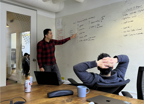
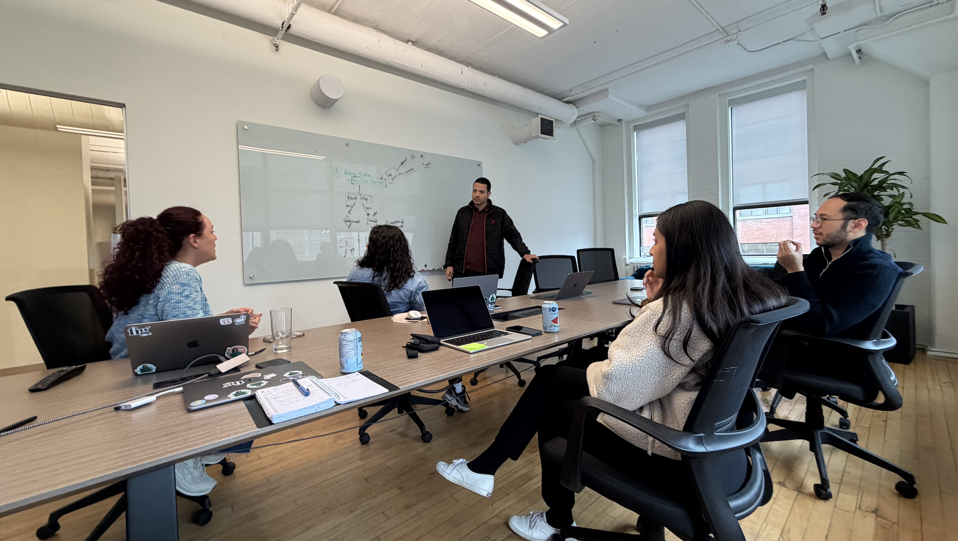
The redesign goal was to increase conversion. To understand where and why the funnel was leaking, we ran a mixed-method discovery phase:
Five rules that shaped every screen
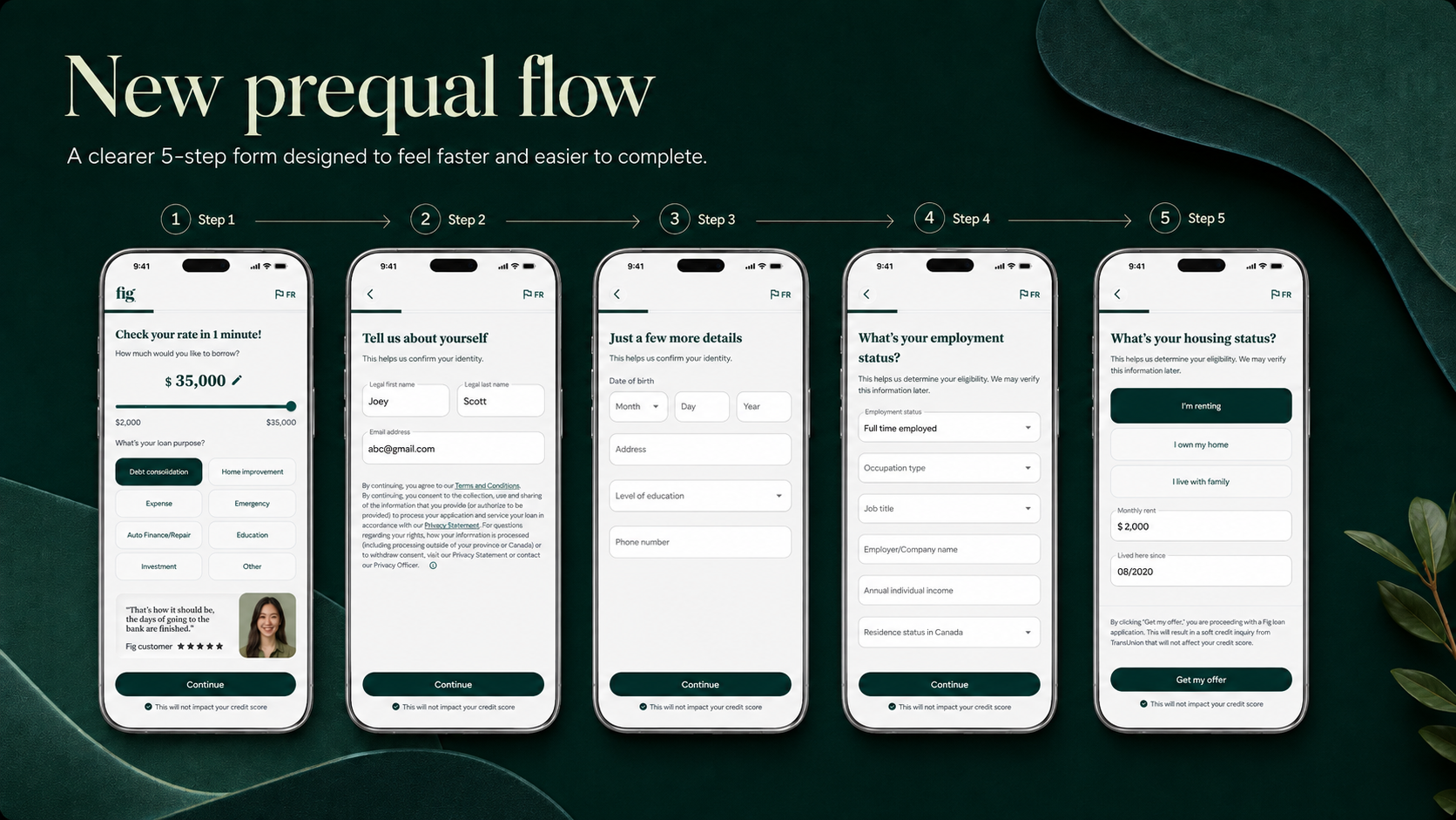
One long form becomes five focused steps
The single form became five mobile-first steps with a progress bar and thumb-sized inputs. Email and phone moved earlier, unlocking drop-off recovery outreach for most of the funnel.
Consent moved from one dense page upfront into smaller asks in context. Biometric consent now appears only right before identity verification, and only for Quebec users, where it's legally required.
Every screen reassures "This will not impact your credit score." Employment and loan purpose moved into pre-qual, so ineligible users are declined in the first two minutes instead of after identity verification.
Four more moments, redesigned to reduce doubt
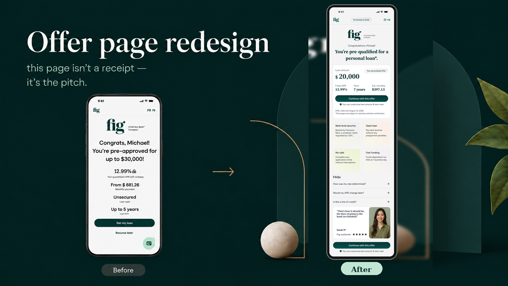
An offer page that closes the loop
Aggregator traffic arrives cold, comparing offers, having never heard of Fig. So the page introduces the company, leads with the numbers users weigh, and pre-answers the questions flooding CX. It isn't a receipt — it's the pitch.
Customize your offer, payment-first
The old screen led with term and buried the number that drives the decision. Now monthly payment is the hero, updating live as the sliders move, with APR locked from pre-qual — closing a trust bug where the quoted rate could drift between screens.
.png)
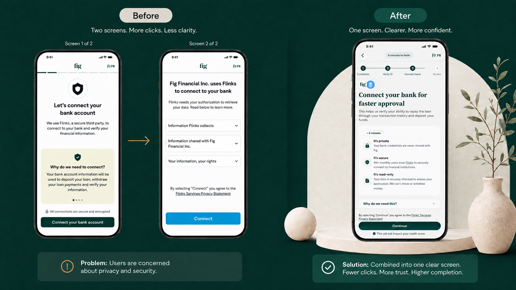
A bank connection worth trusting
Connecting a bank account is the scariest ask in the flow. The splash was rebuilt around the two real objections — credentials never touch Fig, and Flinks is used by 500k+ people monthly — plus a plain answer to "why do we need this?"
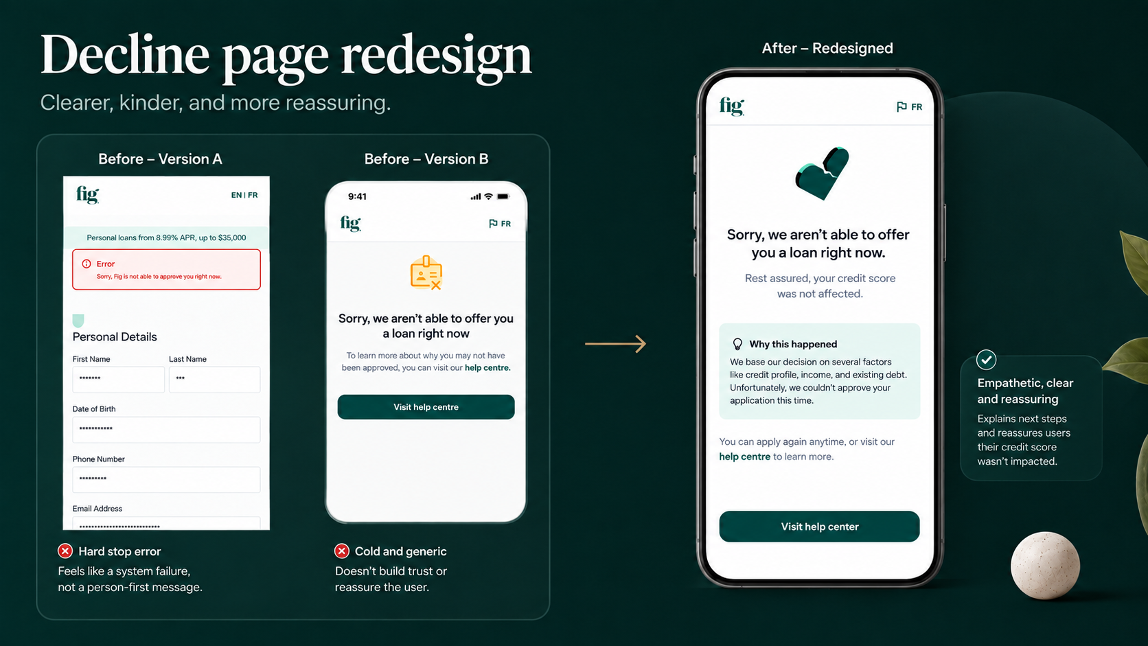
A decline that doesn't punish
Previously, a decline showed a generic error, and users assumed the worst about their credit. The redesign leads with "your credit score is unaffected," then explains what happened and gives one clear recovery action.
A flow built for the phone it's actually used on
Book rate climbed on both channels across the nine months following launch — roughly a 30% relative improvement on each. The lift held through every month rather than spiking once, which is what separates a flow change from a traffic change.
Splitting the form roughly doubled pre-qual conversion — the funnel's single biggest leak. Clarifying the offer, selection, connection, and error moments removed reasons to doubt, call, or quit, on the surface where most applicants actually were. Because pre-qual conversion compounds downstream, the lift carries through to bookings, not just completions.
Trust is a conversion lever
The single highest-leverage copy in the flow is one repeated line: "This will not impact your credit score." Reassurance at the moment of anxiety outperformed any layout change.
Sequencing is design. Moving employment, purpose, email, and phone capture earlier changed business outcomes without changing a single field's UI.
CX tickets are a free research pipeline — every top theme became an in-context answer on the screen where it came up.
Still refining, screen by screen
The flow keeps evolving from what SMS, support tickets, and live chat surface next. Using the Design Playground, I can prototype and ship refinements against production data without waiting on a full release cycle. Click through both prototypes below, step by step, to compare the current flow against the work in progress.